Reading between the fonts
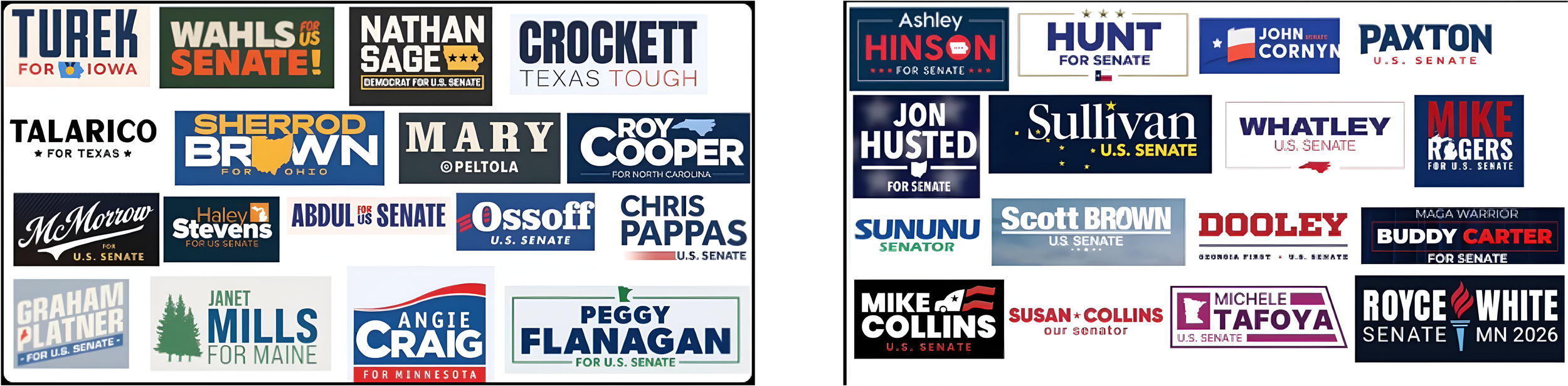
On Twitter/X, the account @polltracker2024 posted two screenshots of campaign logos for some of the most prominent 2026 midterm election candidates. We have posted those screenshots above. Fittingly, the Democrats are on the left, Republicans on the right.
There are some interesting trends, although to be honest we don't quite know what to make of them or how voters would interpret them:
The Republicans almost exclusively use the colors of the flag: red, white, and blue. Michele Tafoya goes with purple and John Sununu sneaks some green in there, but that's about it. Democrats employ a larger palette—off-white, a little orange, a little yellow, a little green.
Republican fonts are all pretty modern, basic, and bold. Many Democrats use fonts that seem old-school: Peltola, McMorrow, Talarico, and Turek feature fonts that look like they came from the 1950s. Even Ossoff—that logo would have been right at home in 1988.
Democrats deploy lots of implied motion. Graham Platner's logo tilts up and to the right, much like the logo used by Alexandria Ocasio-Cortez during her first run. Craig, McMorrow, and Ossoff also feature upward movement to the right. Pappas slightly swooshes to the right, too. For the Republicans, John Cornyn has a little bit of movement with the flag, same with Collins, but for the most part the GOP logos are simple, authoritative, and right in your face.
Wahls uses an exclamation point, which is unusual.
Republicans are generally perceived to have a more disciplined messaging machine than Democrats, and these logos seem to reinforce that. What that means for 2026, who knows? How do you interpret these?
(It would be fascinating to use Implicit Association Testing to measure how people interpret some of these logos.)